PORTLAND, Ore. — Bob’s Red Mill announced a company-wide brand redesign. The update includes a new logo and refreshed packaging. The rollout will begin in September 2026. Additional product categories will transition through 2027.
The redesign features updated typography and redesigned packaging. It also expands dietary labeling visibility. The company said the refresh places a stronger focus on brand heritage and ingredient quality.
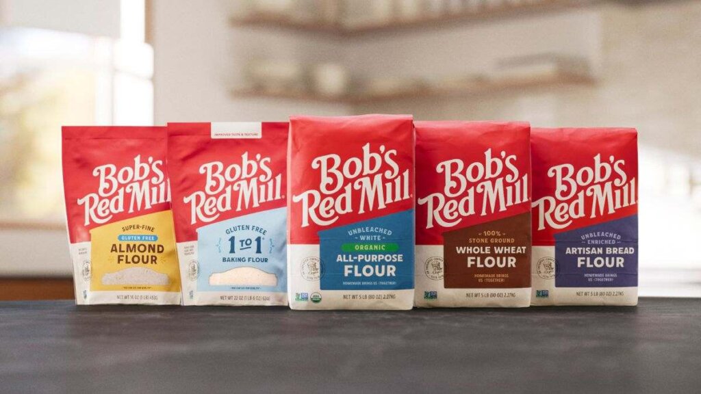
The redesign impacts more than 200 products. Categories include flours, oats, baking mixes, and grains. According to the company, the updated packaging is designed to improve shelf recognition. It is also intended to simplify shopping across multiple grocery aisles.
Bob’s Red Mill said the redesign maintains the company’s identity as an employee-owned food manufacturer.
Consumers can browse the company’s flour lineup through the Bob’s Red Mill flour collection. Additional products are available on the Bob’s Red Mill product page.
Packaging redesign centers on heritage, shelf visibility
The updated visual system includes several new elements. These include a simplified logo and a custom “Red Mill” typeface. The typeface was inspired by hand-painted signage. The redesign also features a new mill illustration tied to the company’s original Oregon location.
The company said product categories will now use color-coded organization systems. The redesign also includes clearer placement of Gluten Free and Organic certifications.
Bob’s Red Mill stated that focus group testing showed the redesign reduced consumer search time by nearly half.
According to Daniel Barba, Vice President of Marketing at Bob’s Red Mill, the redesign reflects both the company’s history and the changing retail environment.
“This is more than a new look; it’s our story, made easier to share,” Barba said in the company announcement.
Margret Brown, Creative Director at Bob’s Red Mill, said the goal was to modernize the brand’s appearance. She added that the company also wanted to maintain familiarity for longtime shoppers.
The redesign project was developed in partnership with design agency Turner Duckworth. The agency has worked with several global CPG and food brands.
Why it matters
Bob’s Red Mill’s redesign reflects a broader movement across the consumer packaged goods industry in which legacy food brands are modernizing packaging while leaning heavily on heritage storytelling.
Many CPG companies are balancing two competing priorities: improving shelf visibility in increasingly crowded retail environments while preserving brand authenticity for longtime consumers. Clearer dietary labeling, simplified logos, and category-based color systems have become increasingly common as brands compete for consumer attention both in-store and online.
The redesign also underscores the continued importance of nostalgia and trust in grocery purchasing decisions. As private label competition expands and younger consumers prioritize ingredient transparency, legacy brands are investing in visual systems that communicate quality, familiarity, and operational consistency.
Industry context: heritage branding remains a major CPG strategy
The packaged food industry has seen an increase in heritage-focused redesigns in recent years. The trend has been especially noticeable among baking, snack, and pantry staple brands.
Many companies are avoiding complete visual overhauls. Instead, they are adopting “evolutionary” redesign strategies. These updates modernize typography and packaging layouts while preserving recognizable brand elements.
For Bob’s Red Mill, the redesign emphasizes the company’s founding story and milling history. It also highlights the company’s employee-owned structure.
The strategy aligns with broader consumer demand for authenticity and traceability in food manufacturing.
The rollout also comes as grocery retailers continue prioritizing shelf efficiency and visual consistency. This trend is especially important in natural, organic, and specialty food categories.
Editor’s note: Source86 perspective
For food manufacturers and private label brands, Bob’s Red Mill’s packaging refresh highlights how visual identity, ingredient transparency, and shelf recognition are increasingly interconnected in modern CPG strategy. Heritage branding remains a powerful tool, particularly as consumers continue seeking authenticity, cleaner labels, and trusted ingredient sourcing.
At Source86, we work with food brands, ingredient suppliers, co-manufacturers, and private label partners to support supply chain transparency, FSQA oversight, bulk ingredient sourcing, and retail-ready production strategies. As legacy brands evolve their market positioning, operational consistency and scalable manufacturing remain critical to maintaining consumer trust. Let’s talk.
FAQs
The rollout is scheduled to begin in September 2026 with core flour products, followed by additional product categories throughout 2027.
The redesign includes a new logo, updated packaging layouts, a custom typeface, color-coded product categories, and clearer Gluten Free and Organic labeling.
According to the company, the redesign only affects branding and packaging. Bob’s Red Mill stated that the ingredients and products themselves are not changing.
External source: Bob’s Red Mill Unveils New Look Rooted in Quality Ingredients, Brand Heritage